 |
Maki Haku drawing the stylized character 岳
for the mixed-media print "Work 74-80 (Mountain)"
before tracing and carving it into the board
|
 |
|
Maki Haku (巻白 1924-2000) is the art name of Maejima Tadaaki who was born in Asomachi in Ibaragi Prefecture. He had no formal art training, although after the Second World War he did involve himself in meetings guided by the visionary modernist Onchi Kôshirô at the Ichimoku-kai (First Thursday Society: 一木会), where he learned much from the master and interacted with other "creative print" (sôsaku hanga: 創作版画) artists. although his earliest work was strongly influenced by Onchi, Maki gradually developed his own style, particularly when he turned to calligraphic motifs and introduced embossing in his mixed-media designs.
Maki began making prints in the late 1950s and continued until 1999. He used various printing techniques and media, but he is best known for his combined woodcut, stencil, plastic lamination, and cement-relief block prints in which the cement-paste (cement mixed with water and chemical bond) was carved, scored, sandpapered, and chiseled. The blocks were then rubbed and pressed onto paper, first with hand pressure and then with the aid of an etching press to produce, simultaneously, a plastic-laminated and raised relief or three-dimensional effect. He used both water-based and oil-based pigments.
Maki's style was sometimes abstract-calligraphic, sometimes representational. When using calligraphic elements, he attempted to adapt traditional ideographs by introducing modernist aspects to their shapes, sometimes abandoning their traditional forms almost entirely, adding or subtracting elements, and rearranging them for aesthetic or expressive effect. For an example, see the photo on the left, where Maki has intentionally distorted the conventional form for the character Gaku (岳), meaning "mountain." Maki thought of his stylized calligraphy as a form of shôkei-moji (象形文字) or pictograms that visually represent the meaning of a word.
Maki once said that, "I have ... tried to give our cultural heritage of such ideographs a modern feel, but in an Oriental style. This means trying to capture the typically Japanese expression of the beauty of space, the sense of reverence for and persistent pursuit of boundless space, while at the same time taking advantage of the boundary provided by the beauty and life of the paper itself." Among his large groupings of designs with highly stylized calligraphic motifs is the "Poem" series.
As is the case with many other modern artists, the placement of artist seals was not haphazard. Maki said, "... seals are an integral part of the composition, providing color and a focal point and thus making the impersonality of the sumi's [black pigment, 墨 or 墨] space deeper and wider and warmer." For an example of placement for two seals in a single composition, see the image at the lower right.
Sometimes Maki referred to specialized dictionaries or old calligraphy texts when making his selections of forms to use for his prints. He would then make many sketches of the ideograph until he was satisfied with the form, which he would trace onto thin paper. The tracing would be placed face down on the board and outlined with soft-lead pencil, transferring the image to the board. If the image was somewhat indistinct, Maki would fill in the lines where needed. He then cut the form into a plywood board.
For print designs requiring his distinctive textured backgrounds, Maki would mix cement with water and a chemical bond. After applying the paste, which hardens in about fifteen minutes, he would sand off any undesirable rough areas, and then use a square chisel to accentuate and sharpen certain contours. Next, Maki used a stiff-paper stencil that was cut very slightly larger than the the calligraphic form, which would then serve as the shape through which he applied the pigments (such as poster paints, oil paints, or offset printing inks). When he incorporated plastic lamination into a design, Maki began by using a soft hand-roller to ink the printing block, which he next covered with a sheet of printing paper and two blankets, all of which he passed through an etching press. The heavy pressure would emboss the paper and print the images. He would then take a second piece of paper covered with diluted rice paste and adhere it to the printed paper by rubbing it with a hand-roller. He followed this with two additional passes of the bonded papers through the etching press, laminating the two sheets and creating even deeper embossing on the paper. Among his designs featuring deep embossing and lamination are many prints that fall under the recurring theme of ceramic bowls, including chawan (tea bowls or cups: 茶碗), which began to appear in his oeuvre around 1979. Some of these works carry a title that includes the English word "Collection."
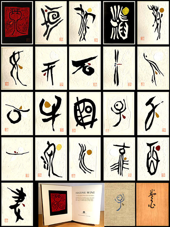
In 1968-69, Maki embarked on one of his most admired projects when he designed twenty-one block prints to accompany a deluxe book titled Festive Wine (Weatherhill, 1969) featuring kayô (ancient poetic songs: 歌謡) composed from the fifth to ninth centuries (see image above right). The poems had been compiled in a handwritten scroll called the Kinkafu (Music for wagon wheels: 琴歌譜). The title refers to an early Japanese harp, a precursor to the modern koto (琴), which Maki stylized in the frontispiece to Festive Wine (see design in red below). The Kinkafu poems were recorded in two forms: verses and song scores. The Kinkafu scroll was discovered in June 1924 in the Kyoto University Library by the scholar Sasaki Nobutsuna, although five of the same poems were known in the Kojiki (Record of ancient manners: 古事記) from 712 CE, an early Japanese chronicle of myths, legends, songs, genealogies, oral traditions, and semi-historical accounts down to 641. Maki's prints offered a lively complement to the content and spirit of the poems. Although Maki's forms are derived from calligraphy and thus have meanings linking each to a poem, it is the designs that were paramount.
 From early in his career, Maki developed a system of using titles that included the year of production. A print such as "Poem 86-55" would be the 55th design completed in 1986, and another with "763" would be the third design from the year 1976. These numbering indications for his designs appear on Maki's prints from the early 1960s to about 1980. The "Collection" series introduced a slightly modified design-numbering pattern, whereby, for example, "Collection 882" means the second print design from 1988 (see image at lower right). Many prints also included the traditional edition numerations for specific impressions of the designs, such as "23/100" (twenty-third print from an edition of 100). From early in his career, Maki developed a system of using titles that included the year of production. A print such as "Poem 86-55" would be the 55th design completed in 1986, and another with "763" would be the third design from the year 1976. These numbering indications for his designs appear on Maki's prints from the early 1960s to about 1980. The "Collection" series introduced a slightly modified design-numbering pattern, whereby, for example, "Collection 882" means the second print design from 1988 (see image at lower right). Many prints also included the traditional edition numerations for specific impressions of the designs, such as "23/100" (twenty-third print from an edition of 100).
Maki’s prints can be found in many institutional collections, including the Art Gallery of Greater Victoria; Art Institute of Chicago; British Museum; Brooklyn Museum, New York; Cleveland Museum of Art; Fine Arts Museums of San Francisco; Harvard Art Museums; Honolulu Museum of Art; Los Angeles County Museum of Art; Museum of Fine Arts, Boston; Museum of Modern Art, New York; Philadelphia Museum; Portland Art Museum, Oregon; and Tikotin Museum of Japanese Art, Haifa.
The text provided here is based in large part on John Fiorillo's web page:
https://viewingjapaneseprints.net/texts/sosaku_hanga/maki.html
|
